When I was new to CSS Flexbox, I read many articles and watched many videos. But most of them were long, and I didn’t have time to read or see them all. So much to do, so little time.
So, I decided to write this article on Flexbox in 8 minutes. I will also share a link to a Flexbox cheat sheet I found to be very useful. It will help you learn Flexbox while designing for the modern Web.
Before we begin, it’s important for you to be familiar with basic HTML and CSS. It would also be helpful to know a CSS Framework like Bootstrap. It would help you get the most from this tutorial.
Flexbox is a pretty new concept in CSS. It solves a lot of problems of Web design like the Holy Grail Layout. Another area where Flexbox helps is appending and prepending elements to other elements.
This is how Wikipedia defines Flexbox:
***CSS Flex Box Layout** is a CSS3 web layout model. It is in the W3C’s Candidate Recommendation (CR) stage.The flex layout allows responsive elements within a container to be automatically arranged depending upon screen size (or device).*
Here are the definitions -
-
**CSS3 **— the latest version of CSS.
-
W3C — World Wide Web Consortium, an organization which develops open standards for the Web.
-
Responsive Elements — When decreasing browser’s size or viewing on tablets and mobile devices, responsive elements change their view like below —
 responsive-web design
If you’ve used CSS frameworks like Foundation or Bootstrap you know it can be challenging to create a responsive web page. With Flexbox it’s super simple.
FlexBox in Action
Let’s start this.
Fire up your text editor, and work along with me. That’s the best way to learn.
Step 1 — Create a folder for your new project. Next, create a file named index.html and enter the code shown below. ( 😆 There is only 1 Step).
<!DOCTYPE html>
<html lang="en">
<head>
 <meta charset="UTF-8">
 <title>CSS Flexbox in 8 Minutes</title>
 <style>
  ul{
   display: flex;
   flex-direction: row;
   border :1px solid red;
   background-color: skyblue;
  }
  li{
   list-style: none;
   width:100px;
   height:100px;
   background-color:#ff00ff;
   margin:10px;
  }
 </style>
</head>
<body>
 <ul>
  <li>1</li>
  <li>2</li>
  <li>3</li>
 </ul>
</body>
</html>
Don’t think much about it now since I’ll explain everything in just a minute.
When you open the file in your browser it will look something like this.
 display:flex; property makes flow in row instead of column.
Notice that in our CSS we added display: flex. This changes our list from acting like a simple block-level element into a Flexbox. Make sure to set this on the parent element, which in this case is <ul>. This is what creates the flex container.
Once the parent element is set as the flex container it handles the child elements so you don’t have to.
Also notice that we added flex-direction: row in the same <ul> section. Flexbox defaults to a row layout. But one feature that makes it so powerful is that you can change the direction by changing the property.
Let’s learn more about that.
Flex-Axis
Remember the coordinate system you learned in math class? It had an X and Y axis which never changed direction.
The Flex Axis is similar, but the axes don’t remain rigid. The main and cross axes change depending on the flex item’s flow. We’ll talk more about this later but for now, remember that the main axis follows the flow.
If we set flex-direction:row, then the axes are as follows:
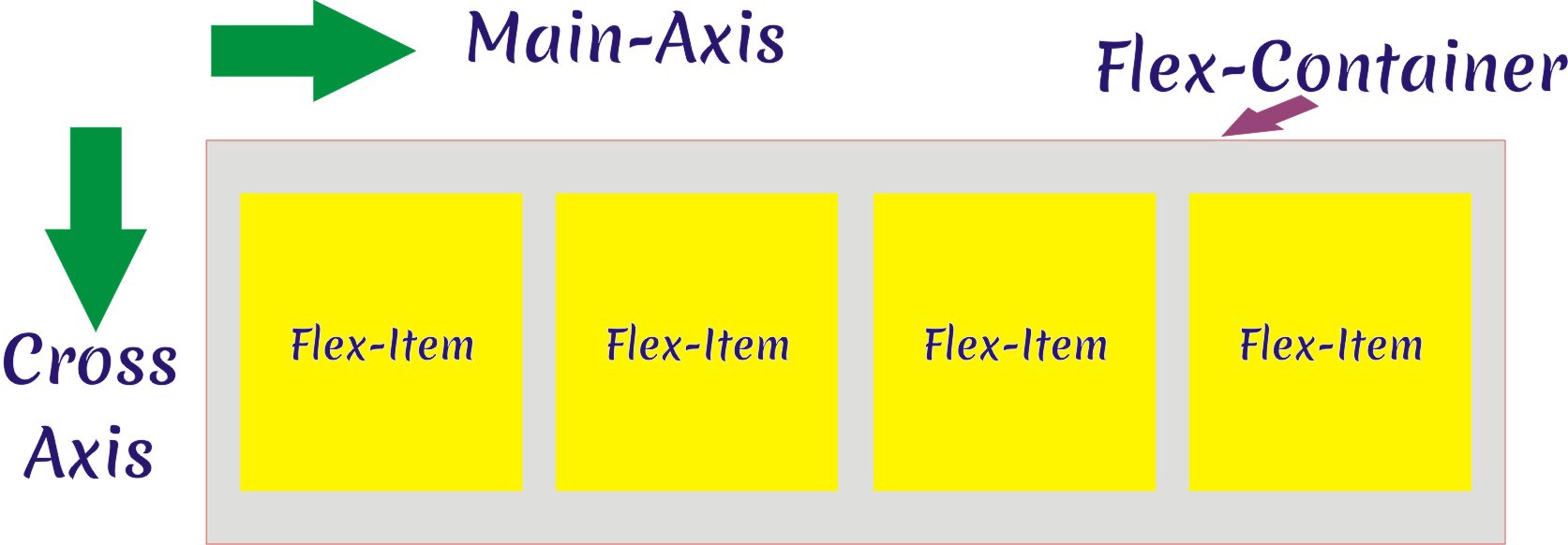 Main Axis and Cross Axis on Default or Flex-direction is Row.
and if we change to flex-direction:column the axes change to this:
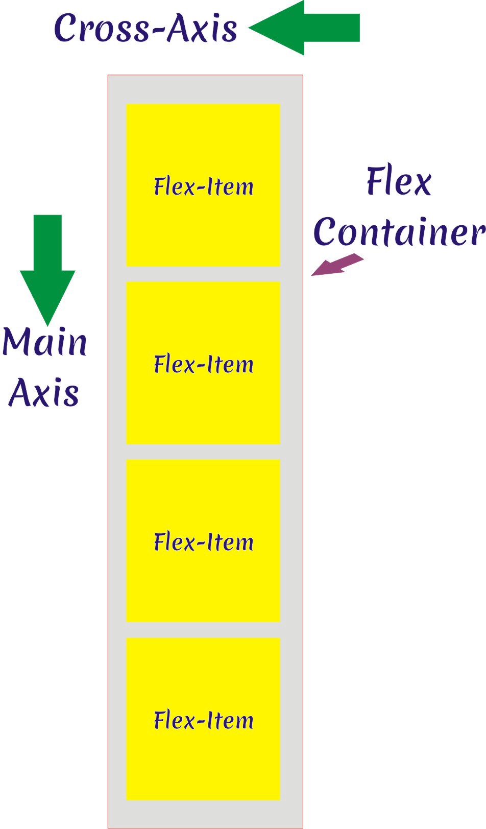 Main axis and cross Axis Reversed on flex-direction:column; property
Flex Container Properties
Flex Direction — This is pretty easy to understand. The direction of flex can be row or column. However, you can reverse the order of the elements in either one. All you have to do is change the property value.
flex-direction can be column || row || column-reverse || row-reverse
Let’s see some examples.
flex-direction:row;
 flex-direction:row;
flex-direction:row-reverse;
 flex-direction:row-reverse;
flex-direction:column;
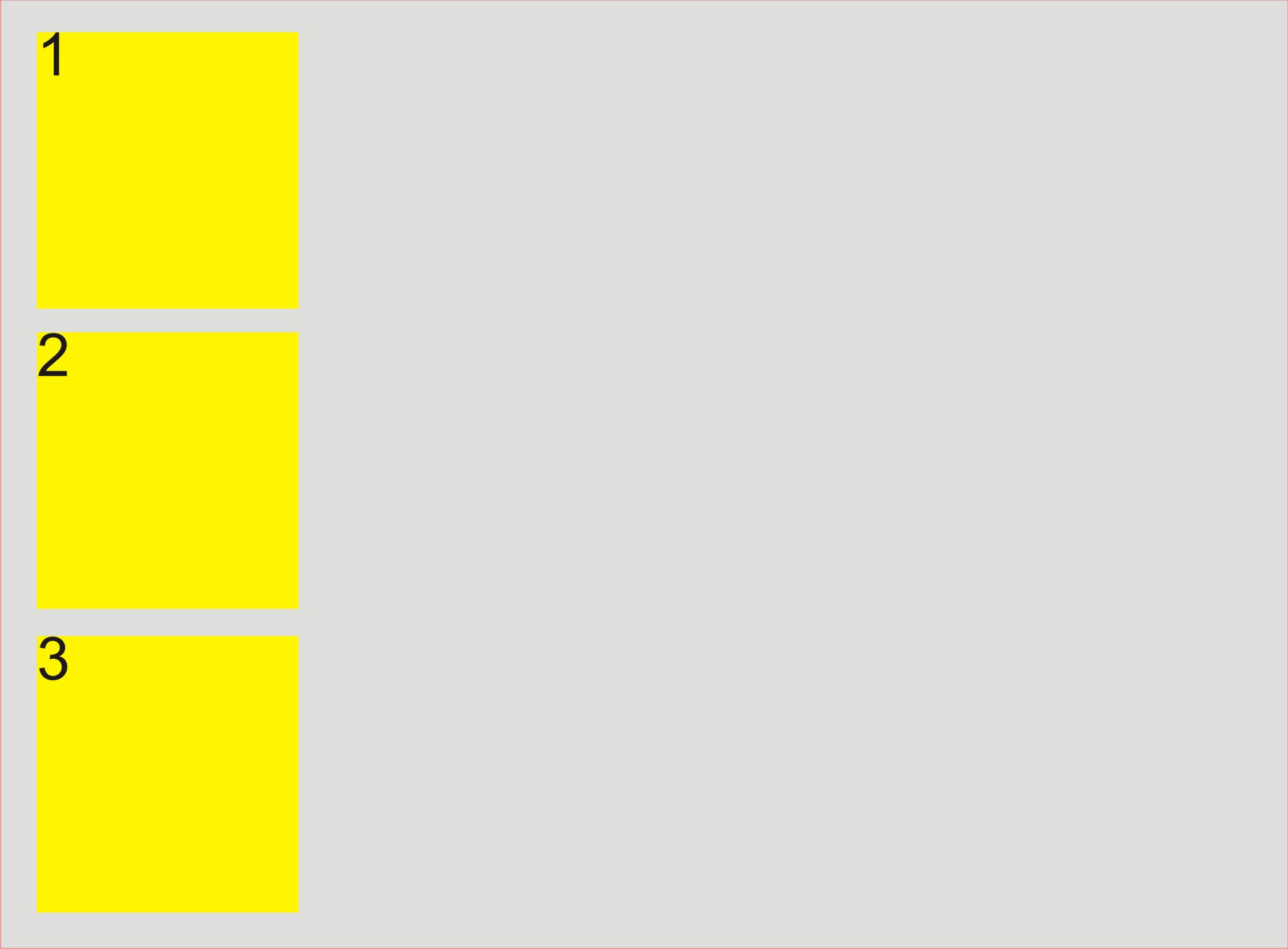 flex-direction:column;
flex-direction:column-reverse;
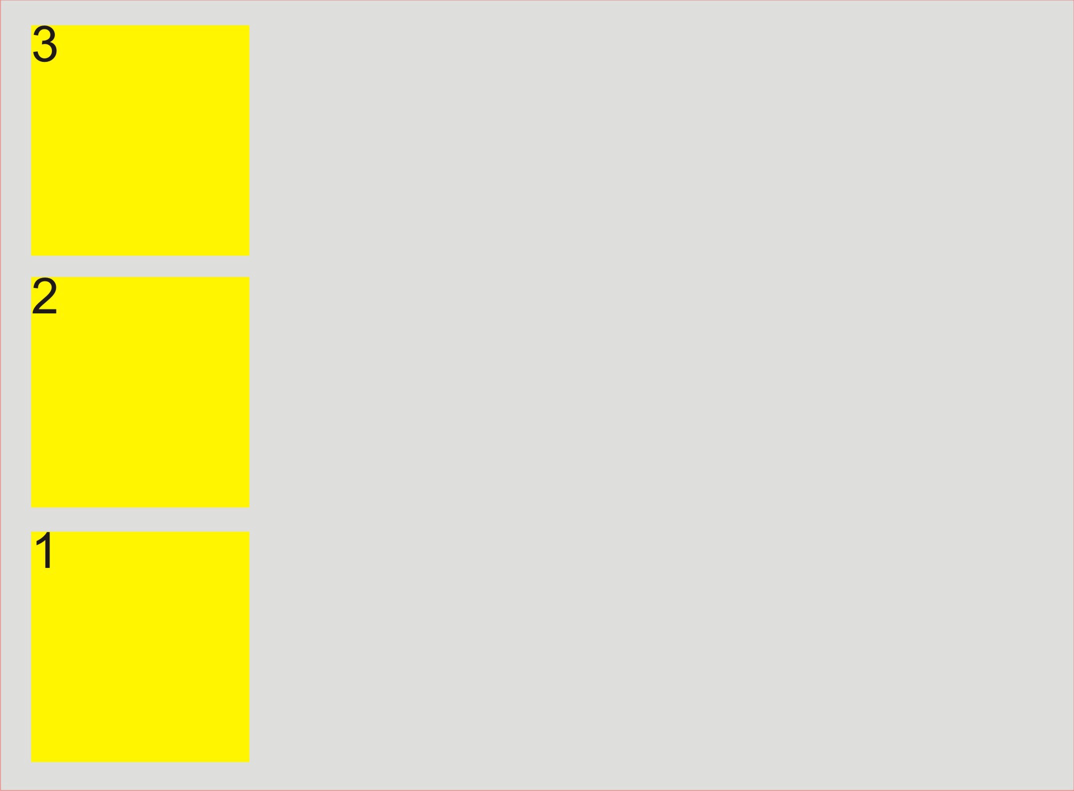 flex-direction : column-reverse;
**Flex Wrap —**If the Flexbox container has items that can’t fit into the available space they shrink until they do. If there are many items they may break the layout by overflowing the container. You can solve this by using the flex-wrap property.
The default value of flex-wrap property is nowrap. This puts the elements onto a single row. As mentioned above, this is not always ideal. Changing the value to wrap will put the elements on multiple lines. It’s like when you wrap text in multiple lines in notepad.
flex-wrap can be wrap || nowrap || wrap-reverse
Here’s how it works.
flex-wrap:nowrap; //or don't write this, this value is default
 flex-wrap : nowrap;
flex-wrap:wrap; //wraps the flex items to second line
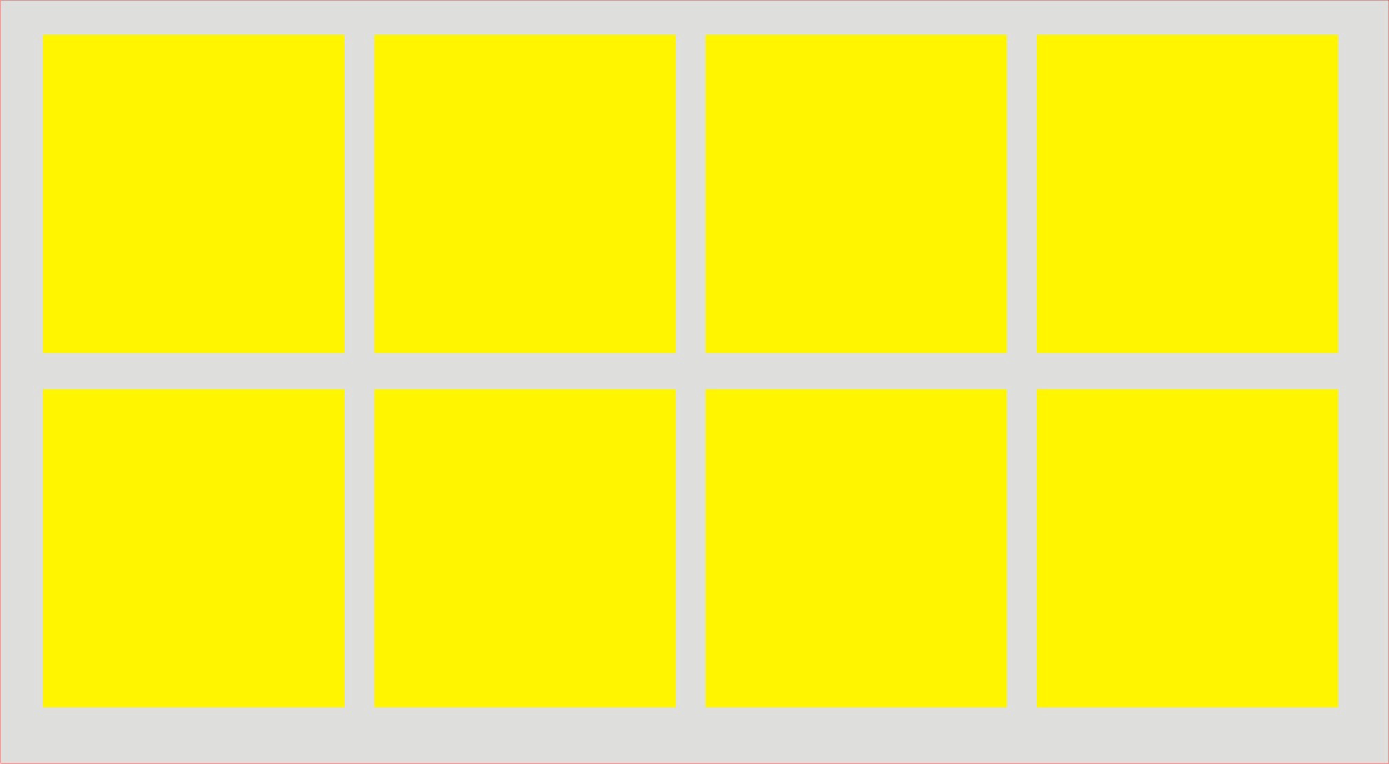 flex-wrap : wrap;
flex-wrap : wrap-reverse; //wraps items in reverse direction.
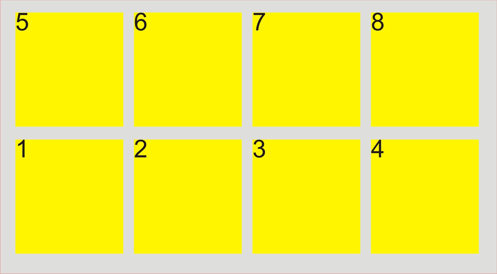 flex-wrap : wrap-reverse; — I have included numbers for this example.
**Flex Flow — **is a combined property for both flex-direction and flex-wrap. It’s a shorthand syntax to make things easier.
flex-flow: column wrap;
flex-flow is equal to writing flex-direction:column and flex-wrap:wrap. It produces the result of both.
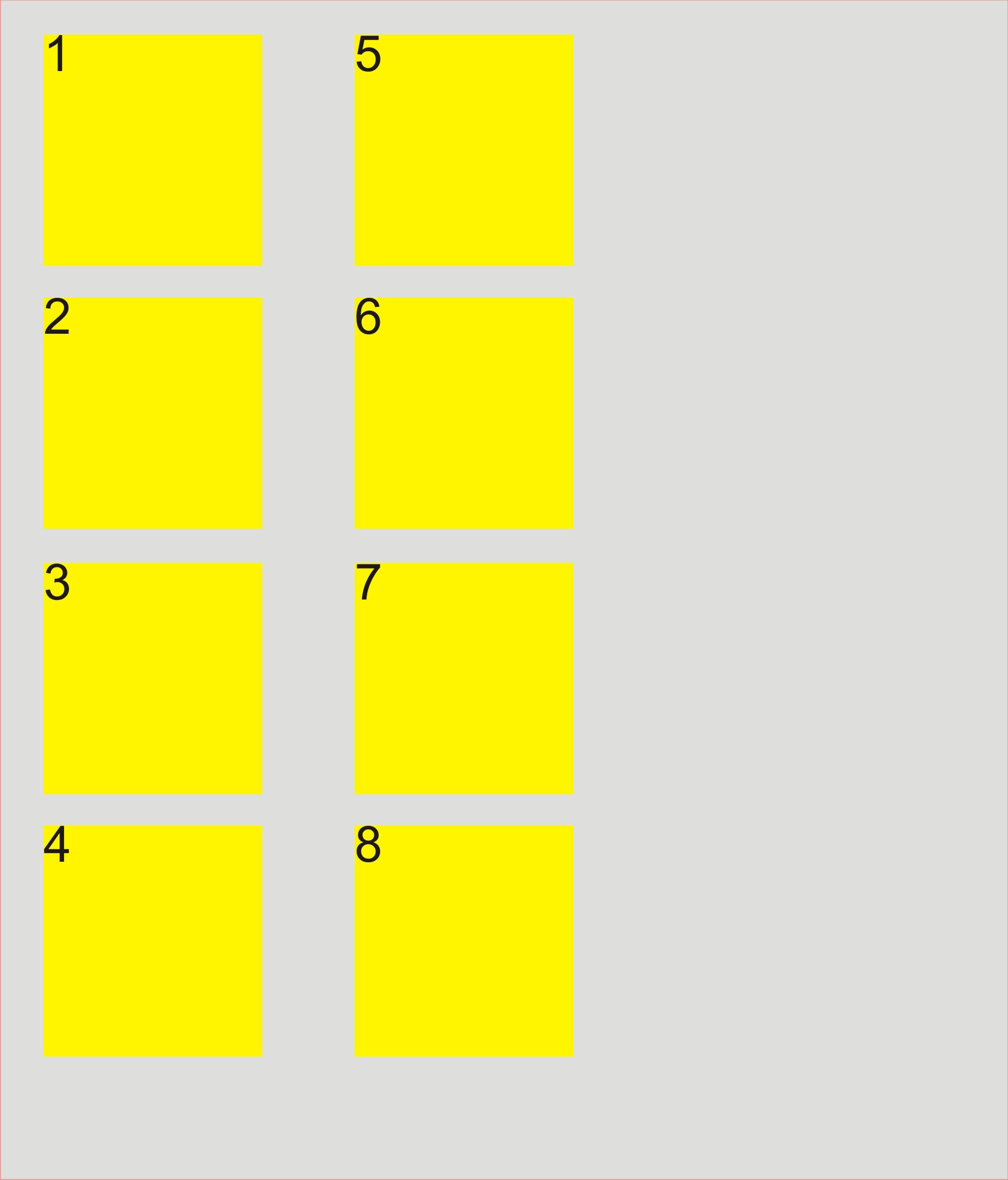 it’s equivalent to writing flex-direction property as column and flex-wrap as wrap; we have specified some height here.
**Justify Content — **This is like justification included in most text editors. With flexbox we justify the flex items on the main axis.
justify-content:flex-start || flex-end || center || space-around || space-between; // set it to anything
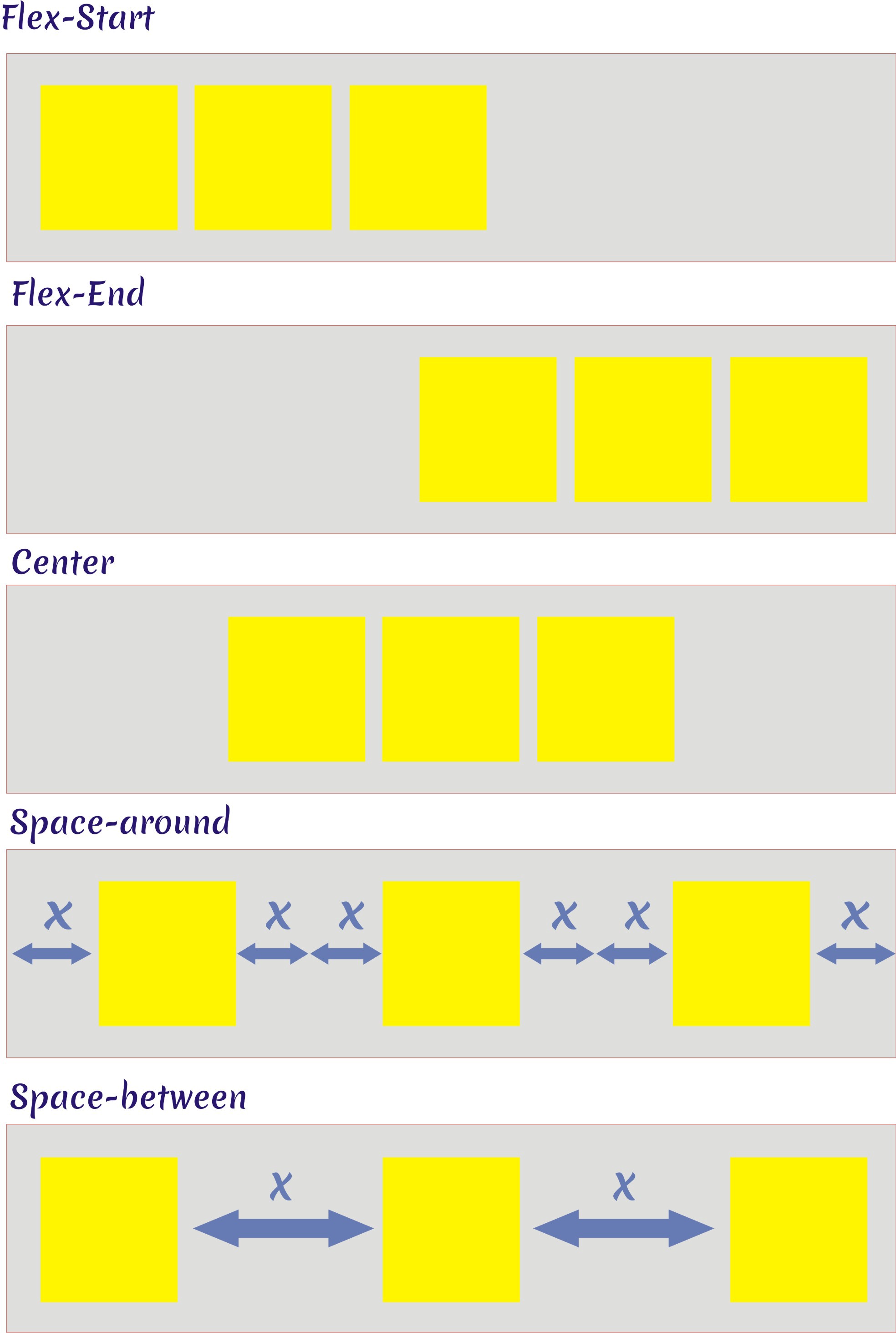 all the justify content properties, produces these results.
Align Items — The align-items property of a flex container is similar to justify-content but it works on the cross axis.
align-items : stretch || flex-start || flex-end || center || baseline; // set it to anything
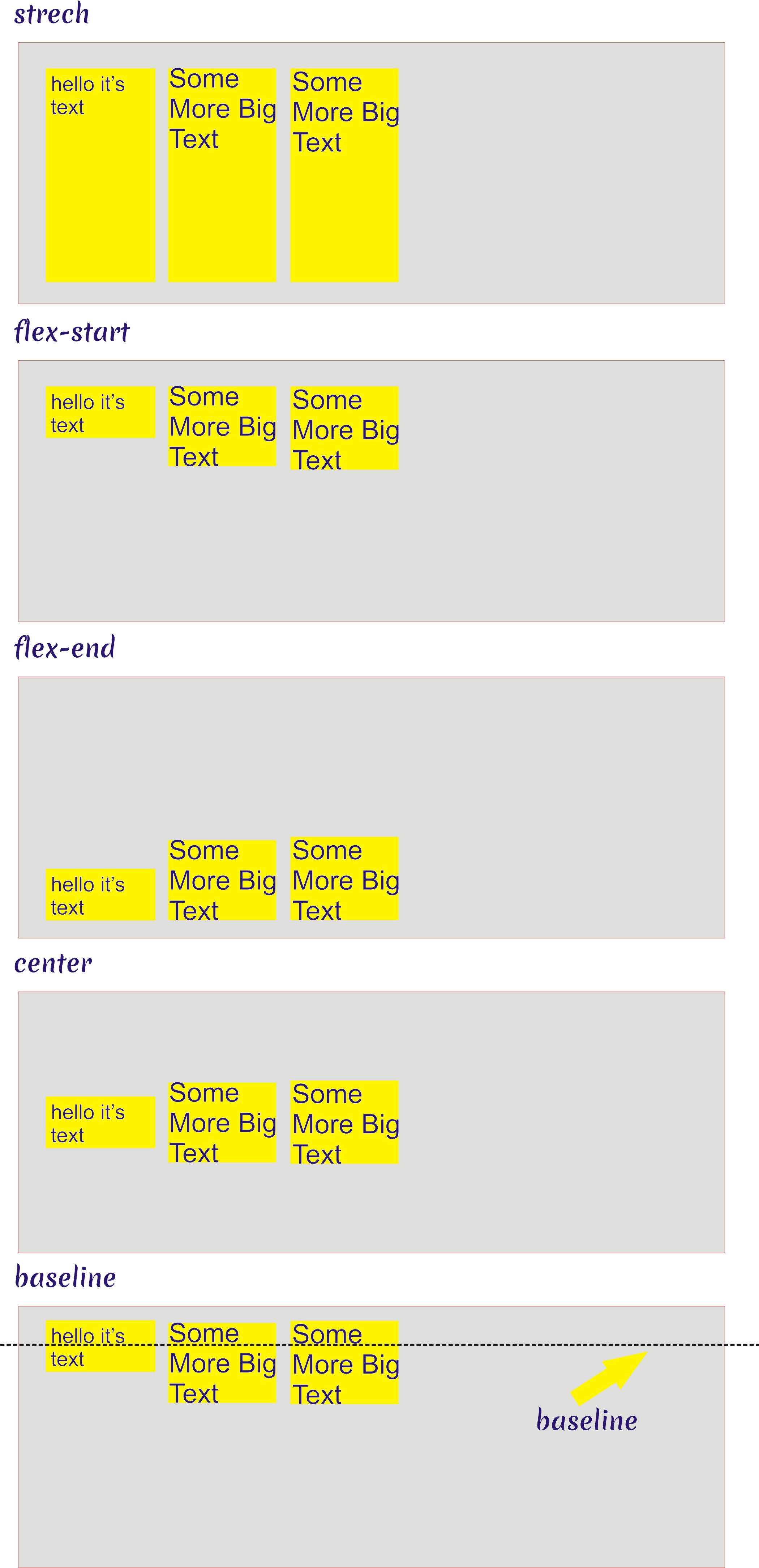 align-items properties.
**Align Content —**If you have used the flex-wrap:wrap property on the container, you can use align-content to align the items.
align-content: stretch || flex-start || flex-end || center; // set it to anything
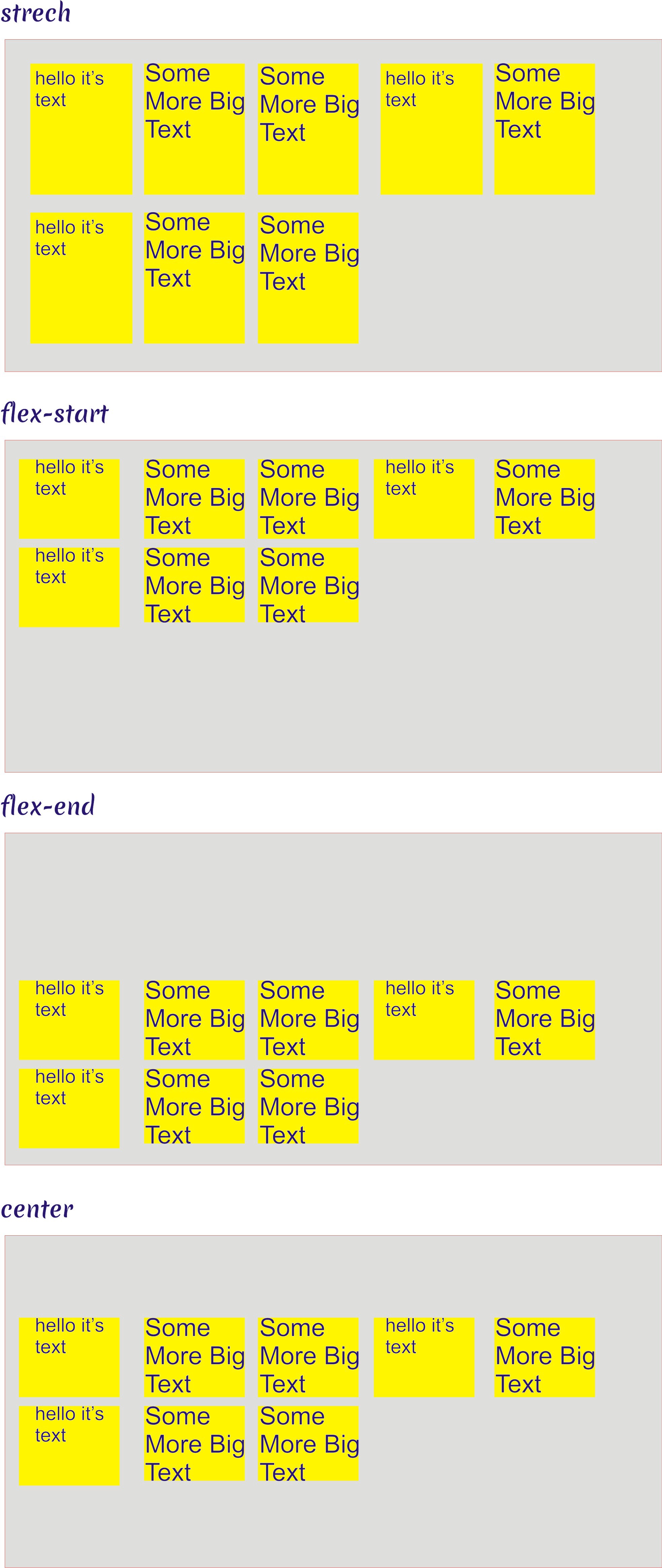 align content properties.
Flex Item Properties
Order — If you want to change the position of a flex item without changing your HTML DOM, then use the order property**.**
You can change the order of any element with a positive number or negative number.
The default order number for all flex items is 0. Changing the order value to a positive number moves the flex element later in the display. Changing the order value to a negative number moves the flex element earlier in the display. Flex elements with the same order number maintain the same order they had in the source.
Here’s a few examples. Note that each example starts from the original sort order shown below.
order : -1 || 0 || 1 || 2; // set it to anything (default is 0)
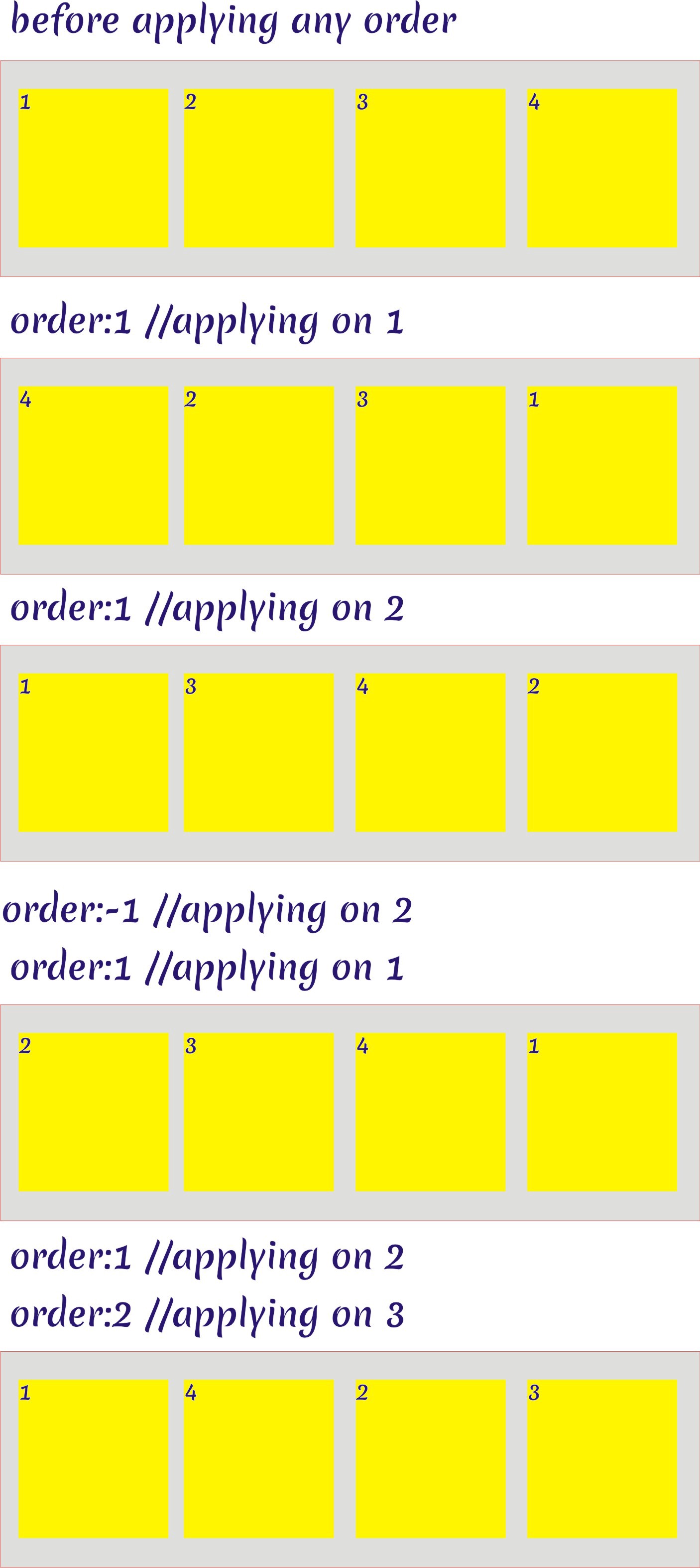 Flex item order property, higher the order, the last the element appear.
As you can see, we can change the Flex-item position without changing any of the HTML code.
Again, the default order number for any element is 0. The lowest ordered element occurs first. The highest ordered element occurs last. But you can’t use a negative order on the first element. Review the examples above to see how it works.
**Flex Grow — **Here comes one of the most important properties of Flexbox.
Remember that the Flexbox container controls how flex items fill the available space. If there are many flex items, they shrink. But what if there is extra space left over? The flex-grow value is the growth factor of a flex item relative to the other items.
Here’s an example.
flex-grow:0||1;
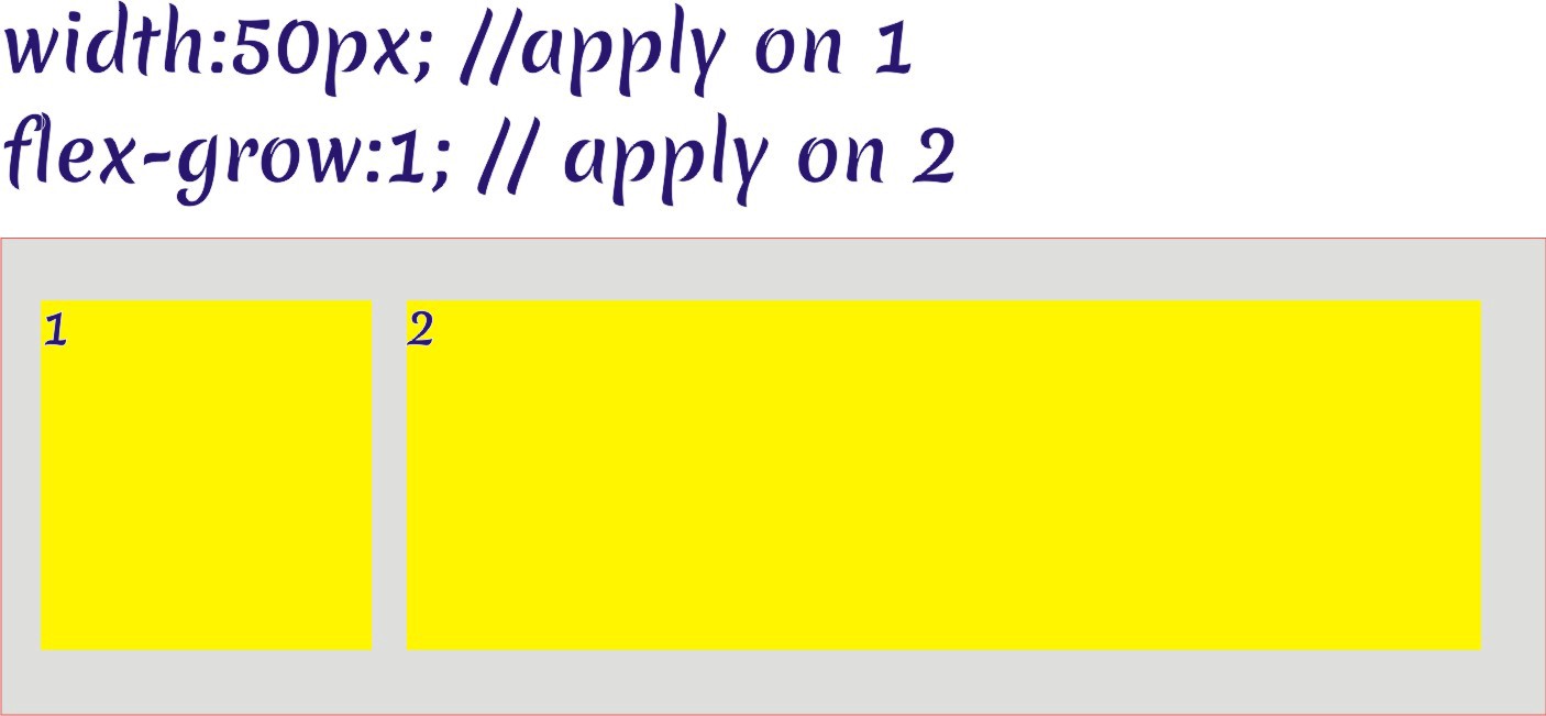 the flex-grow switch is on here, default is off.
When we use the flex-grow switch the flex item occupies all the available space.
**Flex Shrink — **If you want to shrink the elements on the basis of a viewport like a tablet or mobile phone, use flex-shrink.
flex-shrink:1;
It’s like flex-grow but in the opposite direction.
**Flex Basis — **If you’d like to set the initial size of a flex element, use flex-basis.
flex-basis:auto||n px;
n can be the size you set for any flex element and you can set it to accommodate the text.
Here’s an example.
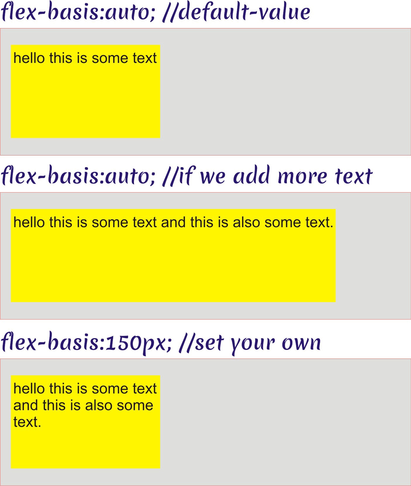 flex-basis property can be set for element resposiveness
The Flex Shorthand
Don’t think that Flexbox is very complicated. You can define it with 4–8 lines of code.
Here is the shorthand to define the flex-item properties. Learn the acronym GSB, for Grow, Shrink and Basis.
The flex-grow, flex-shrink, and flex-basis properties can be set in one line of code.
flex : 0 0 150px;
or
flex: 0 1 auto;
Here are some examples.
Example 1 : Using Flex to Divide sections
<ul>
    <li>1</li>
    <li>2</li>
</ul>
<style>
ul {
    display: flex;
    border: 1px solid red;
    background-color: rgb(222, 222, 221);
    padding:0px;
}
li{
    list-style: none;
    width: 100px;
    height: 100px;
    background-color: yellow;
    margin: 10px;
}

li:nth-child(1) {
    flex: 0 1 25%;
}

li:nth-child(2) {
    flex: 1 1 75%;
}
</style>
 flex shorthand for dividing.
this divides the flex container in 25% and 75%.
Example 2 The Ratio Shorthand
<ul>
    <li>1</li>
    <li>2</li>
</ul>
<style>
ul {
    display: flex;
    border: 1px solid red;
    background-color: rgb(222, 222, 221);
    padding:0px;
}
li{
    list-style: none;
    width: 100px;
    height: 100px;
    background-color: yellow;
    margin: 10px;
}

li:nth-child(1) {
    flex: 1;
}

li:nth-child(2) {
    flex: 5;
}
</style>
this will divide the flex-container in 1/1+5 = 1/6 and 5/1+5=5/6 ratio’s.
 flex shorthand for ratio.
The Last Alignment
The last alignment property we’ll discuss is align-self. It can be applied to individual flex items so that they can be aligned according to the cross axis.
align-self : auto || flex-start || flex-end || center || baseline || stretch ;
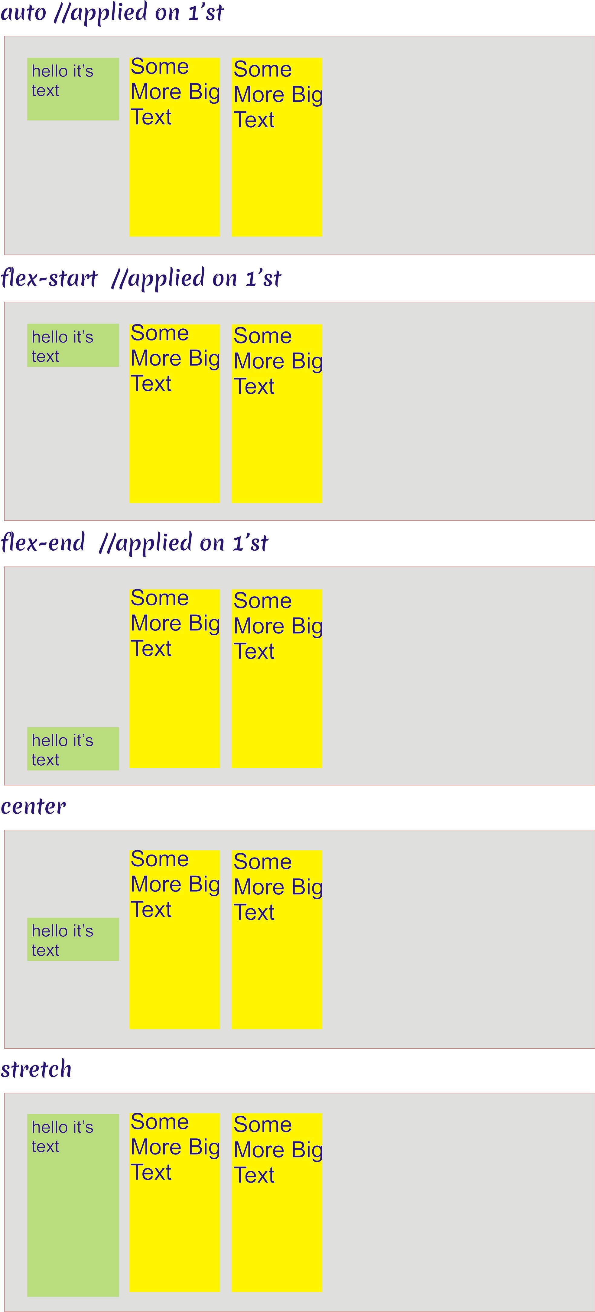 align-self property applied on individual items
FlexBox Reference Material (Including Cheat sheet)
-
Solved by Flexbox by phillip walton
-
Flexbox Froggy — a Flexbox game to learn Flexbox interactively.
I’m a growing Medium Writer, I write on Web and Motivation, you can help me by Clapping 👏 button below as much as you want and please follow my publication on Motivation here. Motivate Bot *creativity is like philosophy, everyone can do it.*medium.com
If you have any questions you can comment down below or contact me on Twitter. motivatebot (@themotivatorbot) | Twitter *The latest Tweets from motivatebot (@themotivatorbot)*www.twitter.com